Last class we looked at changing the layout of the web app for different device and screen sizes.
Does our typography also need to be updated?
When reading on your phone is the screen closer or farther away then reading something on a computer? Most likely, it will be a little closer, in which case the type face may appear larger relative to the screen space.
A good rule of thumb is to hold your phone at the distance you would normally read with your computer in the background. Does the font size look relatively the same? If not, we can add a media query to change the size.
Here, instead of updating specific elements of the page, we can change the baseline for the font-size and line-height. If using em values, the rest of the page will update accordingly.
Fluid type
Other than font-size, another component of readability is the number of characters in a line. There are different rules of thumb as to how many characters should be on one line of text. Some say
As designers, we can these values to get a sense of a baselines, and then use our eyes to confirm.
The Wayne Gretzky quote I've been using is exactly 66 characters.
The number of characters depends on the font-size and paragraph width.
At 1em the line doesn't take up a whole line in the paragraph.
We can change the width to fix it.
At 2em there is not enough text per line.
We don't have more width so let's take it down a bit. 1.35em looks similar to the above example.
Viewport sizing
The above examples show an adaptive approach, meaning again that a rule changes between different values at specific size or breakpoints.
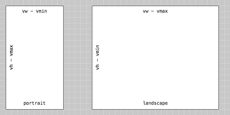
For a responsive approach, one way to approach font-size is using the relatively new vw for viewport width, vh for viewport height.
These rules can also be used in conjunction with the adaptive breakpoints.
1vw is 1% of the viewport width.
1vh is 1% of the viewport height.
vmin and vmax to refer to the larger dimension for either landscape or portrait view.

These rules can be applied to different types of text.
#title {
	font-size: 4vw;
}

.post-text {
	font-size: 3vmax;
}

.post-info {
	font-size: 2vmax;
}